
Researching and designing a unified cloud storage platform
Notos Cloud unifies files from every cloud provider into one dashboard.
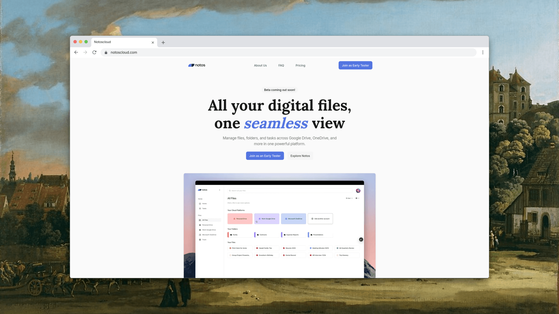
The Notos Cloud landing page and waitlist signup.
- Role
- Lead product designer
- Timeline
- 3 months
- Team
- Michael Septirymen, Avani Dubey, Nikhil Lakhwani
Notos Cloud is an all-in-one platform that reads files from a user's different cloud storage providers and presents them in a single, unified view.
I led product design, research, UI/UX, and QA, working in Figma and Webflow with a team of three.
There are many cloud storage providers that all achieve a similar goal, but spreading files across accounts creates real pain: people lose track of file organization and forget where specific files live.
Our challenge: how might we use design to unify all cloud storage into one platform?
- Files scattered across unrelated provider accounts
- Difficulty maintaining file organization
- Difficulty finding specific files
We started with validity research, surveying 250 people on cloud storage use and pain points. 67% said a unified view of all cloud files was important or very important, and around 60% found it difficult to stay organized and find specific files.
The team and I started devising a product that could read files from different cloud storage providers and present them in a unified view, solving the main issues from our validity research.
We mapped the general user flow for the app in FigJam to align on the core journey before designing anything.
Our answer was Notos Cloud: connect each storage account once, then browse, search, and organize everything from one dashboard. We built a minimal design system based on ChakraUI before designing screens to test with users.
The home screen summarizes recent files, favourites, and today's tasks at a glance, while dedicated views cover files and to-do lists. We kept the layout simple and familiar so new users feel oriented immediately.
We gathered 24 people on the waitlist, who tried a sample flow and gave feedback. Testers liked the simple, familiar layout and asked for more robust features, which we started building into the next version.
The app is still in development — updates ship at notoscloud.com.